Thursday, 18 September 2014

Premiere Vision S/S16 print trend predictions


As those of you who follow me on twitter/facebook/instagram will know, I have recently been on a brief stint to Paris for Premiere Vision. As intense and stressful as being a print designer can be, an expenses paid trip to Paris is definitely one of the perks of the job. 

After months of working in an office environment suffocated by rails upon rails of knitwear, Premiere Vision offers a welcome print fix and an opportunity for me to get out of the office(a nightmare for anyone even remotely creative)and soak up heaps of new design inspiration. As per usual the Spring/Summer 2016 predicted trends did not disappoint, filling my mind with fresh ideas and the motivation to action them. I also had the opportunity to briefly(and it really was briefly as we were only in Paris for the day)look around some of the studios in Indigo and see the designs they were presenting and the trends they were following. Even seeing how each design studio sets up their stall and what graphics they choose to use can be extremely inspirational. My favourite was the backdrop for 'Pattern' studio (http://www.patterntextiles.co.uk/en/index)- colourful chintz florals layered over a rich orange background. I later found out, when looking through their current collection, that this particular print was created as a collaboration between all of their freelance designers, what a lovely idea!

A version of the 'Pattern' studio backdrop in pink.
As well as looking around Indigo and the Premiere Vision S/S 16 trend area, I also attended two WGSN seminars for Autumn/Winter 2015/16 and S/S 16, both of which got me extremely excited. I'm going to do a separate blog post for those as I came away with so much information that squeezing it into this post wouldn't do it justice. Hopefully I'll have those ready to post by Sunday. 

Anyway....I have put together some mood boards showing the Premiere Vision print trend predictions for Spring/Summer 2016...


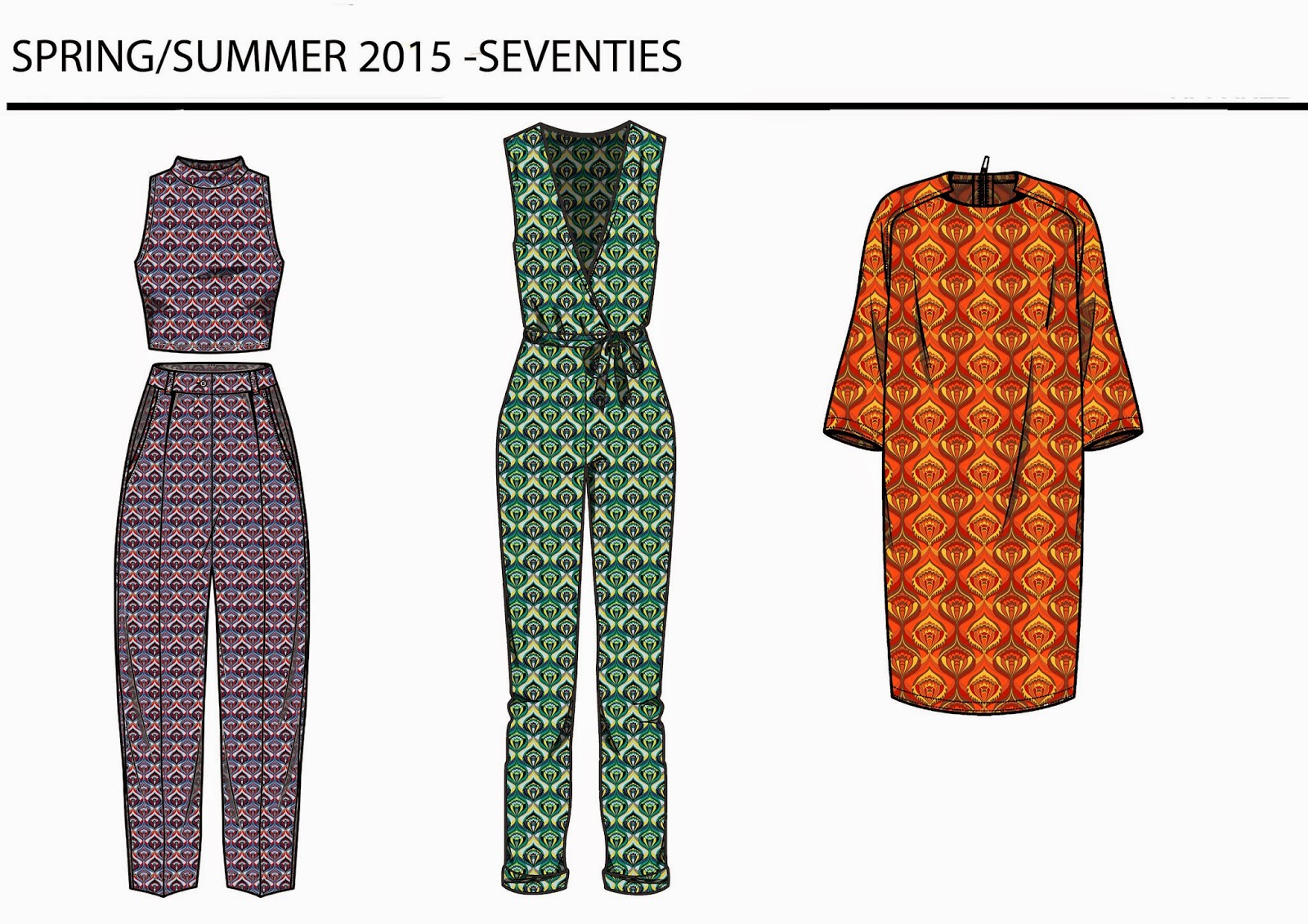
I'm finding it extremely interesting,as I look through the S/S15 catwalk collections, how designers are moving away from the 90's look with its crop tops and bodycons towards a 60's/70's aesthetic featuring flat colourful florals, loose fitting shift dresses and longer length garments. It is also interesting to relate this to the above print trend predictions which seem to be moving in an 80's direction. Being a massive fan of 80's geometric prints, I naturally love the 'interlocking geometry' and 'playful schematics' trends and am so thrilled to see Memphis design patterns being re-introduced. So here is a separate Memphis moodboard in celebration of their return. 


In the spirit of the 80's, popular high street chain American Apparel has embraced Memphis prints by collaborating with Nathalie Du Pasquier(one of the designers from the 1980's Memphis group). Released in March 2014, this recent collaboration combines American Apparels' colourful, easy to wear aesthetic with the graphic post modernist prints that the Memphis design group became popular for. 


On a side note, I have also been pinning like crazy this week so, if you don't already, get following me on pinterest: http://www.pinterest.com/beckyloisburns/


Tuesday, 9 September 2014

Illustration work update

I am very aware that I have been an absent blogger for quite some time now. Life got busy, as it tends to do from time to time. In the last month I have moved house and now have a huge room in Clapton pond with two large windows, my very own bed(after sharing a room and a bed with my friend for 2 months!!!) and two large desks which are proving to be extremely useful given the amount of illustration work I am doing in my spare time. 

I have two exhibitions coming up in October- one in Chelsea town hall and one back home in Lancaster. If any of you want to visit either of them/enquire abut the work I'm showing there please leave a comment on this post and I'll let you know the details!

I have also been finishing off the very overdue floral artworks I have been creating for Bonito cafe in Enfield. With all of this work going on I feel like it's about time I shared some of my own work on this blog of mine. I started this blog hoping to combine reviews on other artists/designers, trends and rend forecasting and some of my own work. As of late/ Since the offset, I haven't really contributed much of my own work so that's what this blog post is all about. 

So first up is a mini project I set myself in response to the Cruise/Resort 2015 collections. I picked some of my favourite trends/the trends I feel will be most popular next spring(2015), these are: Seventies, Pastel/De-saturated palms, Zodiac symbology and Moroccan tiles. I've done a moodboard, print and CADs for each trend. To see my full Cruise/Resort 2015 print trend follow this link: http://textilecandy.blogspot.co.uk/2014/07/resort-2015-trends-post.html 


Next project I've been working on is a 6 piece commission for Bonito cafe in Enfield.  This is my first paid commission from an unbiased client, by which I mean no-one in my family/group of friends. Understandably I'm quite excited about this!This group of work has also been the first time I've used a wacom board to digitally paint straight onto the computer.

The preliminary sketch work.


Alongside this I have also been working on some artwork for Arteria gallery in Lancaster for their Autumn/Winter exhibition which runs from October-January. For this collection of work I have decided to create Autumnal animals in the patterned style I have come to love so much. They are still unfinished but here are the starting points...

Starting points plus the area of my bedroom I have turned into my exhibition prep wall....+wine(of course) 


So yeah... I've been pretty busy. I've also been getting some portrait requests in the same style as above which I'm quite excited about getting started on. Hopefully one day I'll be getting enough exposure to get me a steady supply of commission work, I'd love to do all of this full time one day. 
For now, however, It's just something I do on weekends nd in the evening- my own little form of escapism. 

The next post I do will most probably be a trend post as fashion week season has started again so I will be spamming you all with heaps of print trend boards over the coming weeks. I'm also going to Premiere Vision, a textile trade show, next week so will no doubt be doing a blog post on the predicted trends for Autumn/Winter 2015. 

If you've liked looking at y work you can see more on my facebook page: www.facebook.com/textilecandy or follow me on instagram @beckylois burns as I update these with new design work regularly. 

x

Monday, 4 August 2014

#makeaneffortmonday Mythological symbols in contemporary culture


Time for my post of the week that takes a bit more thought than your average review. This week I want to look at mythology and deities(particularly Greek mythology) and how symbolism used in mythology has seeped into contemporary culture in such a discreet way that we don't even notice. 

Dolce&Gabbana's womenswear catwalk for Spring/Summer 2014 kicked off this trend with a Greek inspired collection featuring photographic prints of temples and statues. 

Image C/O  http://thestyleobsessedcookie.blogspot.co.uk/2013/09/mfw-dolce-gabbana-ss-2014.html

As a follow on from this the Autumn/Winter 2014 Catwalks included a development of this Greek trend. Karen Walker's collection shown at New York included prints inspired by Greek Gods in Ancient pottery; Antipodium provided a move on from the D&G collection with limbless Greek sculptures. Designers such as Isabel Marant and Sass&Bide continued this Greek theme by referencing the decorative elements of ancient pottery which often depicted mythologoical creatures.

Taken from my previous blog post: http://textilecandy.blogspot.co.uk/2014/03/celestial-and-ancient-greek-imagery-aw.html 

The imagery in the design collections above are fairly obvious examples of contemporary culture referencing Greek mythology, but there are so may more discreet mythology related images. Car brand logos, for example, seem to make subtle references towards mythological creatures and gods.


Vauxhall- The vauxhall logo features a Griffin holding a flag. A Griffin is a mythological hybrid of a lion and an eagle,unknown origin as it seems to be a consistent feature in myths cross the globe. 

Saab- A mythical birds head features in this logo. Taken from the Swedish coat of arms of the company's founder(Count Von Skane).

Abarth- Carl Abarth used his astrological sign Scorpio as the logo for his car brand.

Mazda- The name comes from Ahura Mazda, the god of wisdom, intelligence and harmony in early Asian civilizations.

Volkswagen Phaeton- In Greek mythology Phaeton was the son of Apollo(the God responsible for carrying the sun across the sky with his chariot). One day Phaeton insisted on driving the sun chariot and, after almost crashing and burning the earth to a crisp, was killed by one of Zeus' many thunderbolts. 

Maserati-The Maserati logo is another marque that takes its design from the town of its manufacture, Bologna, Italy. The trident is part of a well-known sculpture in the centre of town.

Subaru- According to Greek mythology, the six stars show in the Subaru logo were once Atlas' daughters. 


Pandora- Pandora, as Greek mythology states, was the first human woman created by the Gods. She also made the unfortunate decision in a moment of curiosity to open a jar(box) releasing all the evils of humanity into the world.

Hermes- Greek god of transitions and boundaries; moving between the mortal and the divine.

Trojan- Trojan horse tale from the Ancient Trojan war.

Amazon- A nation of female warriors in Greek mythology.

Nike- Greek goddess personifying victory.

Apollo-Greek god of light, truth, prophecy, healing plus many more.

Argos- Argos was believed to be the birthplace of Perseus, a character in Greek mythology.

Starbucks- The infamous Starbucks logo is dominated by the siren with two fish tails in the centre. In Greek mythology Sirens were responsible for luring sailors to their deaths by enticing them with their beauty and musical prowess.

Apple- Depending on your religion and your opinion of the bible, the apple logo is a product of the biblical tale of Adam and Eve in the garden of Eden. The Apple represents the forbidden fruit from the tree of knowledge.

Trident- A 3 pronged spear carried by Poseidon/Neptune the God of the sea in Ancient mythology.

Caduceus- Used for medical institutions across the globe, this symbol actually derives from the staff of Mercury, the Roman God of financial gain, luck and trickery. It is generally accepted that this is because of a misunderstanding between the caduceus and the rod of Asclepius, the Ancient Greek God of medicine and healing. 


In recent years even films have been drawing inspiration from mythology and folklore. It seems we have become fascinated with fantasy.

The above are just a few examples of how corporate logos have covert meanings and how symbols often derive from the antithesis of their contemporary associations. On reading back through this post I have realised how strong a presence images taken from Greek mythology have in our society. It is somewhat reminiscient of the film "My Big fat Greek wedding" ...here's a clip....


Well that's all for now, I hope you enjoyed my #makeaneffortmonday post. I'll hopefully make time for another post/review at some point this week :)


Sunday, 3 August 2014

#Sundayreview

As warned in my most recent trend post, I have been away on holiday for a week and so haven't been able to blog. However, I have now returned with a Sunday/week off review.

I spent most of my time off at a camp with several of my friends in Rye. It was so nice to get away from the city and experience a slower more peaceful pace of life, I get so tired of the London rush and had almost forgotten what it felt like to be in the country. It was also a great opportunity to spend quality time with some of my closest friends. Being near a beach for a week contributed a huge amount to ensuring I had a relaxing week off. I also used the time away as an opportunity to give two of my friends belated birthday sketches which I had created for them. The joys of being penniless in London-every gift is handmade!


I have also officially moved into my new studio in Hackney Wick. I am so excited to have my own workspace and am really looking forward to having all my art supplies and pieces I'm working on in one place. So here are a few photos of what it's looking like at the moment, I've put a little bit of my work up and have made a start on an inspiration wall...


While moving into my new studio I also had a wander around the Wick and stumbled across the Stourspace art gallery (http://www.stourspace.co.uk/). Here I came across these quirky characters with hilarious phrases written in naive childrens hndwriting. My personal favourite is the "God. I want to be an artist" piece! 

With gallery spaces located in close proximity to my new studio, I am hoping that I will find a lot of new exhibition opportunities.


Saturday, 26 July 2014

Resort 2015 trends post!

Once again this is an overdue post but I've been quite busy figuRing out what to do with my life, redoing my portfolio then editing the reworked portfolio. I've also been visiting some studios to try and find a place to set up so I can get some independent work done. I have actually managed to find a shared studio space in one of the Hackney Wick warehouse which I have paid the rent for and will be moving my arty stuff in to next weekend so I will post a few photos of it on here when I have some. I'm hoping that I'll feel a lot more motivated to do work in my spare time If I'm already paying for a place. 

On a more positive note I have passed 50,000 page views so I'm taking a cringey moment to thank all of you that read my sporadic blog posts for your support and your continued reading. It's really re-assuring to know that people are actually reading what I'm writing and makes it a bit more worthwhile.

Despite my new blog format, which I am still very keen on, this post is actually a trend post for the recent resort 2015 collections.


The seventies trend seemed to be quite big throughout the resort collections,  not just in the geometric and paisley printed garments, but also in the styling of the collections and the garments shapes. Longer length hippie styles, capri trousers, polo necks and oversized shirt colours were all popular and there was a strong 70's colour palette of earth mustards, rust oranges and turquoise/electric blue tones.


Red&Blue colour combinations seemed to be a strong trend across all of the Resort 2015 catwalks.


As we all know florals are a recurring trend for Spring and the Resort 2015 collections featured 3 different floral trends:

- Linear florals: Line based illustrative floral shapes, minimal colours.


- Painterly florals: Watercolour effect petals, loose lines, blurred effects, hand painted.


- Simple/flat florals: Pop art-esque, solid flat areas of colour, thick lines, moroccan tile florals.


The abstract trend from A/W 2014 is still present in the Resort 2015 collections but not as strong as in the previous collections.


One of my favourite trends seeping through the catwalk collections at the moment is the Moroccan tile trend.This trend feels extremely fresh and unexplored with its bright topaz and turquoise tones against rich reds and oranges, could this be the print that marks the festival season for next year?I hope so!
 First introduced in A/W 14 by the likes of Temperley, KTZ and Preen by Thornton Bregazzi, this trend has been championed through the Resort 2015 collections by Chanel, Thakoon and Tia Cibani. In my opinion Chanel's Moroccan tile collection will be the Resort 15's equivalent to Burberry's' recent painterly collection and Celine's abstract brush strokes. When prestigious fashion houses like Burberry or Chanel move away from their trademark design style the fashion industry pays attention and a trend is born. This is what I think will happen with the Moroccan tile trend.  


Another trend that seems to be coming through in the Resort 2015 is a more primitive trend. A move on from the abstract trend featuring prints inspired by tie dye, aboriginal art and loose mark-making.


As predicted at Premiere Vision, tropical prints were huge in the Resort 2015 collections. There seemed to be a lean towards painted watercolour tropical prints in softer muted colours.


As has come to be expected in recent years, animal prints were also popular. In recent collections we have seen a move towards giraffe and zebra prints and brightly coloured leopard prints. For the Resort 15 collections, designers seem to have regressed back into more earthy, natural animal prints, leopard and snakeskin being particularly popular.


Stripes and Spots were also very popular in the recent collections. Opening Ceremony and Tsumori Chisato were probably two of my favourites for this trend.


Another thing I have noticed while browsing through the Catwalk collections was a lack of conversational and novelty prints, which is why I have yet to create a conversational board. 

Well I hope you've enjoyed looking at my take on the Resort 2015 catwalk trends. I won't be posting anything for the next week as I am on holiday but I will try my best to make a post next weekend showing you my new studio and what I've been working on!