Tuesday 27 October 2015

The new colour palette for Spring/Summer 2016


Oh how I wish fashion week and Premiere Vision were spread out a little bit more. I have been working intensely on getting these trend boards finished and I'm still only half way there. I have all of the print boards to finish.....and the Premiere Vision trend boards...as well as my full time job. It's times like this that I question if there is actually a point to me doing all this for a blog that only has 55 followers. Then I remind myself that I enjoy looking at the new trends and the boards make for good reference points.

So here is the first installment of my fashion week trend posts: Colour.

For Spring/Summer 2016 pretty much anything goes. The lack of print throughout the collections was made up for by the bright colour palette on show. As a lover of bright colours, here are 3 new colour combinations that I particularly liked:

1. Blue and orange


2. Blue and yellow- I recently featured this colour theme on my new instagram layout, follow me @beckyloisburns and take a look :)


3. Solid primary colours- red, blue and yellow with touches of green and orange. This is the colour theme I'm using on this week's instagram posts.


The S/S 16 collections also provided a softer, less garish, colour palette to cater for those not keen on the brights. Nudes/Natural shades were popular across all locations, varying from soft beige tones to dusty pink and rose tinted creams. Often paired with delicate lace and voluminous ruffles as part of the new romanticism trend.


New York fashion week
London fashion week
Milan fashion week
Paris fashion week
Purple made an appearance in the SS16 collections in a variety of shades from dark aubergine and dusty lavendar to lilac and rich amethyst tones.

New York fashion week
London fashion week
Milan fashion week
Paris fashion week

Sugary pastel palettes were also present at all fashion weeks. In past collections pastel colours have been paired with white to create a fresh, feminine look. In the S/S16 collections the sugary tones were combined with other colours and placed alongside black, adding a new strength to this trend.

New York fashion week
London fashion week
Milan fashion week
Paris fashion week

Pink. So. Much.Pink. Generally I am not a fan of pink, usually it is a colour which is reserved only for my lipsticks. The hot pink that seems to be emerging, however, is something I could definitely get on board with.

New York fashion week
London fashion week 
Milan fashion week
Paris fashion week

Black and white as a colour combination is pretty timeless, which is why it emerges every year. The Spring/Summer 2016 collections, however, saw an increase in black and white being used both as prints and as solid colours. So many collections consisted solely of black and white garments. 

New York fashion week
London fashion week
Milan fashion week
Paris fashion week

Orange is another colour which I would normally shy away from. As the daughter of a scaffolder, fluorescent orange and yellow scream hi-vis jackets and workmens uniforms- which is exactly the route Moschino chose to take with their roadworks themed collection. Despite this I am a big fan of the flame orange, borderline scarlet, colour that seems to be coming through.

New York fashion week
London fashion week
Milan fashion week
Paris fashion week

Generally my feelings towards yellow are the same as my feelings towards pink- I don't wear it. But with so many of the runway collections featuring this colour, and with so many different shades to choose from, even I will have to get involved with this trend.  From Buttercup yellow at Edun to Bright yellow at Jonathan Saunders to ochre yellow at Issey Miyake, SS16 has provided a plethora of choice. 

New York fashion week
London fashion week
Milan fashion week
Paris fashion week

Green also made a come back on the runway. Shades of Emerald, Apple green and Sage green alongside deeper forest greens and khaki. SS16 really is the "anything goes" season in terms of colour.


New York fashion week


London fashion week

Milan fashion week
Paris fashion week
Blue has been increasing in popularity over the past few seasons but really seems to have peaked in the SS16 collections. Although there are some softer pastel blues, the majority of designers chose to use darker inky shades with pops of zaffre blue and cobalt.

New York fashion week

London fashion week

Milan fashion week

Paris fashion week

That's it for the colour trends of Spring/Summer 2016. As you can see above there's quite a huge range on next season's colour palette- black, white and neutrals are still present and popular but bright colours are back(finally!!!) Hopefully I will have another trend post done by the end of the week,although my laptop seems to be fighting against me at the moment.


Sunday 11 October 2015

Zandra Rhodes Spring/Summer 2016 collection and my new Instagram theme

Zandra Rhodes Spring/Summer 2016 collection.

I was happy to see that Zandra Rhodes showed a new Spring/Summer 2016 collection at London fashion week. In my 2nd year at University(back in 2011) I did a 2 week internship at her studio in Bermondsey, London. It was quite an experience- I spent time working on stylised designs in her studio, looked through her archives of previous collections and was able to look around her penthouse apartment. The internship left a lasting impression on me and became a benchmark for me to work towards. I would love to live above my own studio and have my own design brand.

Zandra Rhodes' apartment. Images taken from: google and http://theinteriorstylelist.com/zandra-rhodes

Rhodes' penthouse apartment is so unbelievably colourful- such a reflection of her personal style. I used to, and still do, love colour but in recent years I have tried to tone down how I dress to avoid people seeing me as the crazy artsy type. I've decided to give up doing this, I like colour, sometimes I might wear a little too much but I've come to the conclusion that life's too short to dress for other people. 


One day I want to be able to wear my own designs and create my own style completely from scratch. Until then I'm going to start dressing for myself, matching colours and prints together fearlessly without concerning myself about other people's opinions. 


One day I want to have my own brand showcasing my own illustration work and creating my own prints for garments. A big part of being successful in contemporary culture is how you use social media. I keep talking about getting back into blogging and being better at promoting myself and yet I don't seem to have much follow through on my plans. So in an attempt to get things moving a bit faster I have decided to sort out my instagram and give it a colour theme. 
I want to use it to show things that inspire me: artists/designers I like, images from nature, quotes to keep me motivated, architectural design,a few obligatory selfies/style posts and photos of my own work. Hopefully this new layout will encourage me to get back into doing more drawing too as I will have to be creating illustration content for the planned posts. I'm aiming to do 2 posts per day and will follow the layout below. 
To give you a quick idea of what the content might look like I've filled some of the boxes with previously posted instagram photos and have used the same black and white photos in all 3 colour combinations. 
I'm hoping that by doing this I can gain more followers and get more people interested in commissioning me to do illustrations. I guess I'm kind of seeing this as a step towards going solo in the design/illustration world. 


As most of my illustrations end up monochrome(I always fear that colour might ruin them) I want to make sure that this is worked into my instagram colour theme, although I do not want it to be entirely black and white- I love colour far too much for that. I have settled on alternating between colour and monochrome images to creative a checkerboard pattern.
I also intend to create a rainbow effect on my instagram feed. I will work with a 15 image rotation as can be seen above and will change colour theme every 15 images starting with pink, purple, blue, green, yellow, orange and red (it has to be done in reverse order so that when viewers scroll down a rainbow effect is created). On completion of all 7 colours of the rainbow  I will do 15 images of an interesting colour combination as can be seen below.


I'm actually really excited about getting started on this and I'm quite pleased with how these mock up layouts look but, as always, would love some feedback on them if anyone has any suggestions for improvements?Or equally if you like how these look please let me know :) I'll be doing my first 2 posts tomorrow starting with a rainbow colour palette to introduce the new theme.
If you want to check whether or not I'm actually sticking to this new idea my instagram is: beckyloisburns


Saturday 10 October 2015

Spring/Summer 2016 collection favourites: New York, London, Milan and Paris

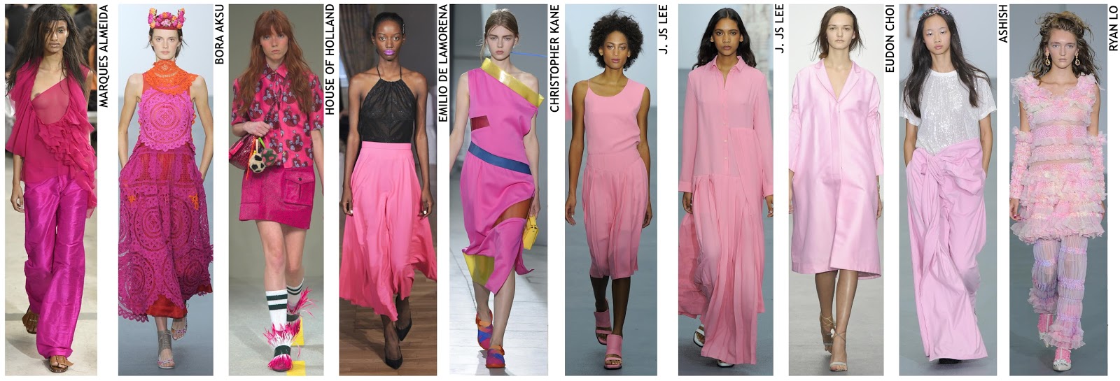
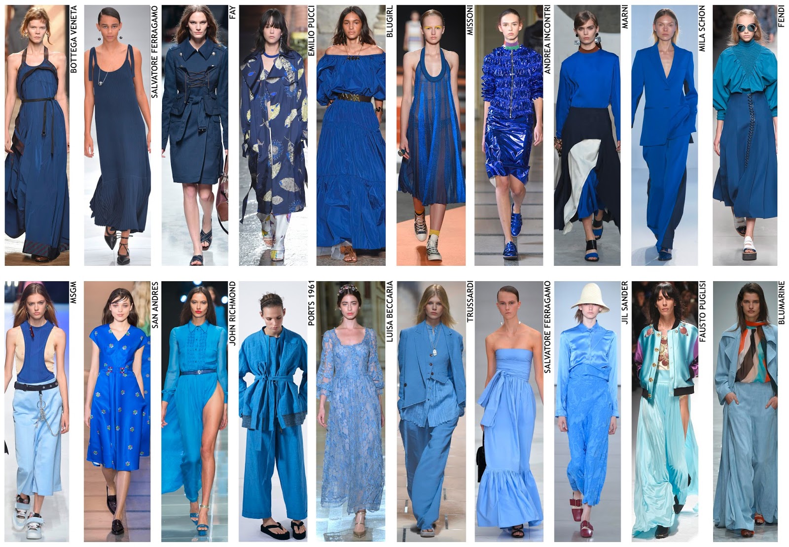
September welcomes many things; the beginning of Autumn, an awareness that the festive season is just around the corner and... the fashion weeks. This post is about the latter. Now that it's October the 4 fashion weeks are over and I can begin posting about them. 

In all honesty I have not been too impressed with the runway shows for Spring/Summer 2016. Prints were scarce in comparison to recent seasons and there has been an obvious preference for texture and colour over print throughout the collections. As much as I love bold colours, my life(work, blog, hobbies) is grounded in print so it's absence concerns me.  

Despite this I have picked out my favourite 4 designer collections from each of the fashion weeks(New York, London, Milan and Paris)and, as can be expected, the collections I have chosen all strongly feature print and borderline garish colours. 


- NewYork: Victoria Beckham -

Bright pops of colour set against strong bases of black and white. Graphics include saturated photography with surf silhouettes and clean stylised floral motifs.

- New York: Coach -

Floral pattern mixing and printed leather gives this collection an extremely laid back bohemian vibe. Pattern mixing was a popular trend in the S/S16 catwalks (trends soon to be posted).

- New York: Hilfiger - 

More pattern mixing seen at Hilfiger combined with strong stripes and dark ground chintz florals.

- New York: Vivienne Tam - 

Tam managed to introduce the popular S/S 16 oriental theme through her graphics without seeming too tongue in cheek. As with the Victorian Beckham collection,Tam has used a strong black and white with a touch of bold colour as her colour palette.

- London: Holly Fulton - 

Bright colours, embroidered denim and naive florals with a nod to the maritime theme that seems to be slowly working t's way into the S/S 16 collections.

- London: Christopher Kane - 

Bright fluorescent lace and spray paint prints combined with juxtaposed coloured geometric shapes- Christopher Kane's collection is a nod to the increasingly popular pop art-esque print.

- London: Jonathan Saunders - 

Pattern mixing, bright colours and oriental styling, Jonathan Saunders marries 3 of the top seasonal trends together seamlessly.

- London: Temperley - 

Temperley always features in my favourites- the colour palette always flows smoothly between each look and the pieces ALWAYS feature prints. 

- Milan: Au Jour Le Jour - 

A bright pop art colour palette with conversational prints to rival Andy Warhol pieces.

- Milan: Etro -

Bohemian(as expected)- 'ethnic' inspired prints, rich and earthy colour palette and floaty maxi length garments.

 - Milan: Marni -

More pop art primary colours, flat bold graphics and loose shaped garments.

 - Milan: Pucci -

Maritime theme, applique and fish/shell prints and illustration of Captains and mermaids.

- Paris: Chanel -

Bright colour, patterned stripes, aeroplane/airport clean graphics, painterly brush stroke prints, layering.

 - Paris: Kenzo -

Bold,bright geometric graphics with abstract and rope prints, pattern mixing, primary colour palette with a dash of mustard yellow.

 - Paris: Manish Arora -

Bright colour scheme, intricate pattern graphics, shimmer oil slick fabrics.

 - Paris: Valentino -

Tie dye, deep rich colours, hand drawn graphics, leather work, African aesthetic,