From a print style perspective I couldn't really identify a definite theme among the catwalk florals for this season as there was such a huge variety. This being said one obvious trend emerged, dark ground florals dominated the design collections.
I particularly loved the collections where the designers paired the dark ground floral trend with a sheer fabric as shown at Valentino Red, Cinq a Sept and Etro.
One interesting thing I noticed in the A/W16 collections, which I will talk about in further detail later in this post, is how designers seem to be experimenting with texture and surfaces a lot more- both Kenzo and Etro painted floral prints onto black leather and I absolutely can't get enough of it!
At Premiere Vision, in February, one of the trend predictions for Spring/Summer 2017 was micro florals (http://textilecandy.blogspot.be/2016/02/premiere-vision-springsummer-2017.html). I have also had a dislike for mini-florals for most of my life, but these dark ground interpretations with wide spacing between the motifs have just about won me over.
As previously mentioned, not a huge fan of the ditsies. I am yet to be convinced by these colourful mini floral prints but I thought I would include them anyway as this isn't a trend report of the things I like; it's a complete report separated from my opinion.
Unlike mini prints, black and white florals are something I can completely get on board with. I especially love the brushed black print effect on a white ground at Paule Ka and Alexander Wang, I think this could work pretty well on commercial knitwear too which is always a plus.
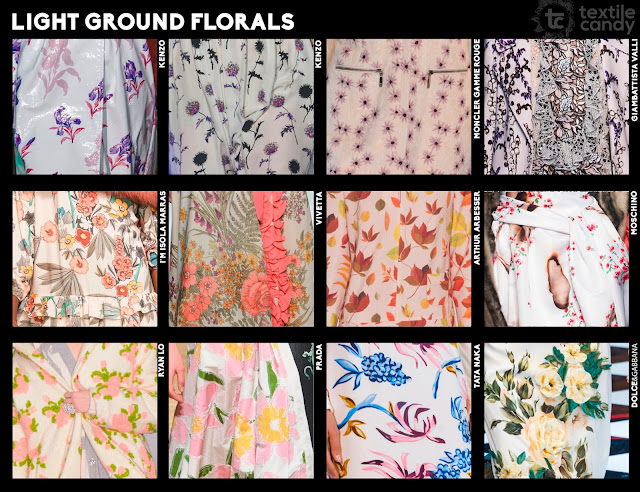
As in the Spring/Summer 2016 collections the 'As above so below' (an opposite for every print) style continues into Autumn/Winter. For every dark ground floral, there was a light ground counterpart.

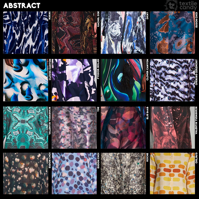
Although florals seem to be more popular commercially, I think abstract prints are by far the easier to wear. The abstracts shown on the A/W16 catwalks are no exception to this rule.
As I mentioned in the Autumn/Winter 2016 Menswear runway print report (http://textilecandy.blogspot.be/2016/02/autumnwinter-2016-menswear-trend-report.html), animal has been absent from the catwalk collections for a while. Autumn/Winter 2016 has seen a return of animal print in both menswear and womenswear.
Leopard and cheetah prints are pretty standard for animal prints- I'm much more excited by the deer skin prints at Clover Canyon and the printed fur effect in the Calvin Klein collection.
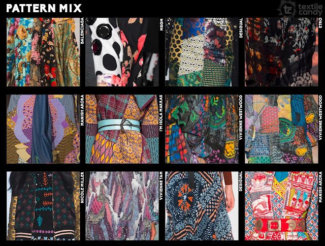
I'll be completely honest here, I thought pattern mixing would be a more popular trend when I first saw it emerge at Premiere Vision. On reflection I can understand why it might not be as it isn't the most commercial trend. Of the pattern mixing examples on the runway I did find, I don't particularly think any of them were done well. This being said, it IS a runway trend so I have to include it, but I wouldn't necessarily advise anyone working into it too much as it doesn't seem to have that much of a following.
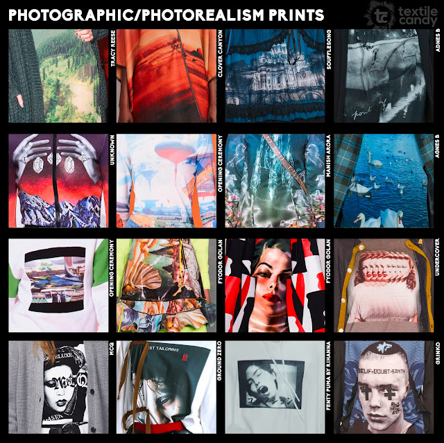
As with the animal prints, photo prints are also working there way back into the collections.
Placement graphics were also quite popular on the runway, particularly images of two facing motifs and one centrally placed image.
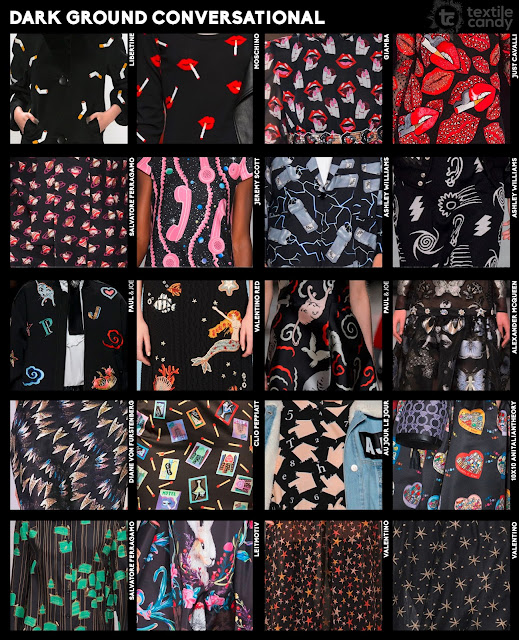
Conversationals are also massively on the rise. Perhaps with all the terrorism, political stress and warnings of economic recession, designers have decided to inject a little fun into our lives. Regardless of the reasoning, I love the dark spin on these conversationals.
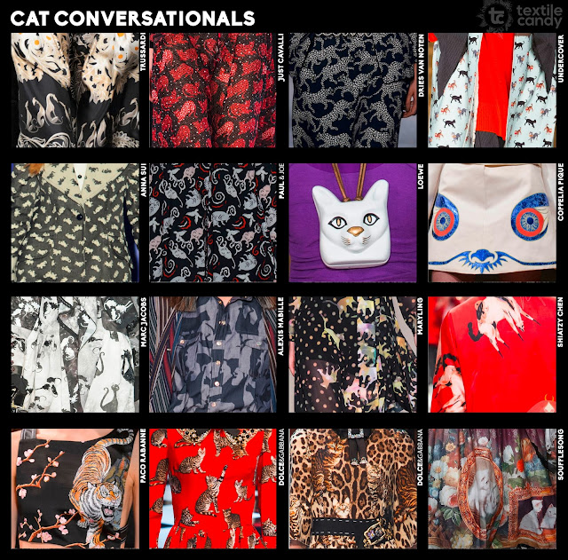
Normally I would include the next two boards as part of the conversationals and placement graphics boards but there seemed to be just too many birds and cats to ignore.
Now for the slogans. One huge thing I noticed about the Autumn/Winter 2016 womenswear collections was how print styles that have recently been runway redundant have now been re-employed(did I extend that metaphor a little too much....maybe?) A/W16 saw a return of animal prints, photographic imagery, conversational prints and slogan graphics.
Recently I noticed an increase in runway fashion being used as a political platform to voice opinions, often controversial ones. Autumn/Winter 2016 collections took this a step further with designers commenting on sexuality(Hood by air), celebrity culture and the treatment of animals(Elisabetta Franchi) among other things. I have to say that I absolutely love it and think that this is what fashion is meant for- to express opinions and act as a canvas for personality. I'm extremely interested to see how the high street retailers interpret the new political slogans for fast fashion.
Offering a flip side to the seriousness of the above slogan styles, the 'Positive pop' slogans are upbeat and optimistic in bright, exciting colours.
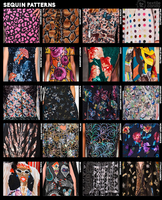
That's all the print categories I have prepared for this section of the report, but I also noticed a few popular print techniques emerging on the runway, which is more of a comment on the fabric/textile techniques rather than the print. Foil/Glitter print, solid sequin patterning and sheer fabrics with printed applique are all fabric styles that create the look of a printed garment without necessarily having to be printed.
My colour and style trend reports will be live on the TextileCandy blog by Friday this week, one again apologies that it has taken so long! x










1 comment:
dd
Post a Comment