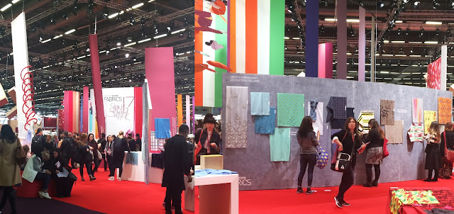
I always find it quite interesting to see the display signage at Premiere Vision as it always hints at the trends they are predicting. Last year the signage consisted mainly of fruit, this year it was flowers.
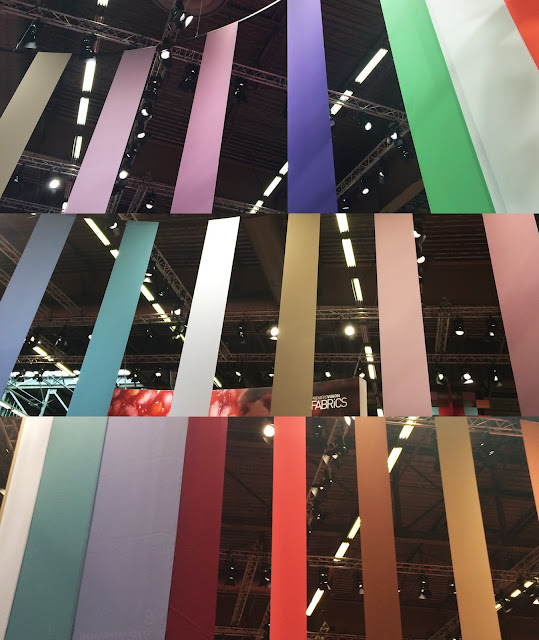
Another thing I really liked about how everything was displayed for this season was the way the colour palette predictions had been hung as banners from the ceiling. Even if you didn't buy a colour tasting trend book/pay to visit the seminar, you could still get a solid feel for the Spring/Summer 2017 colour palette. From what I could see, it combined sugary pastels with warm camels and cinnamon tones and highlights of bright orange, green and white.
For Spring/Summer 2017, Premiere Vision presented 19 print trends. I have combined these to produce 15 print trend boards that I believe in, as always I have also edited some of the names.
On a whole, the hand drawn feel we have been seeing over the recent seasons seems set to continue but taking on less of a delicate linear outline form. Lines seem to be becoming heavier and more abstract; the arts and crafts style florals predicted for Autumn/Winter 2016 have moved into botanical illustration inspired florals; the oriental influence has been abandoned in favour of more Indian inspired designs and digital prints have almost been completely abandoned(which I honestly don't mind as the world is digital enough);quirky conversationals are also beginning to ease their way back in.
---------
Brushstroke florals are the colourful option for SS17. Reminiscent of the loose, painterly florals of the 1980's all are of a mid tooversized scale and have a free, hand painted feel.
Felt-tip florals are another colourful alternative, they feel almost like a move on from the AW16 trend prediction of unfinished florals. This trend seems to be inspired by the new fad of adult colouring books- flat colours and solid outlines with some areas incomplete.
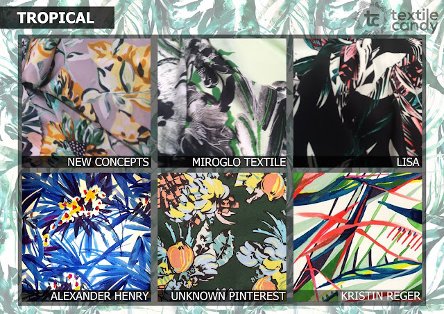
For Spring there is nearly always a tropical trend and I am so glad that this time we are moving away from the standard palm tree imagery. Following the painterly tone set by the felt-tip and brushstroke florals, the tropical trend for SS17 also has a very loose hand painted feel. Premiere Vision has showed imagery which seems to be moving away from the palm/cheeseplant foliage in favour of more floral abstraction
Another floral related trend for Spring/Summer 2017 is the floral mosaic- the patchwork update. In the Spring/Summer 2016 catwalks (http://textilecandy.blogspot.be/2015/11/print-trends-springsummer-2016.html) we saw this at DVF, Mary Katrantzou, Etro and Jonathan Saunders, amongst many others.
It seems that whenever there is an oversized, expressive floral trend(brushstroke florals) there is a tight and orderly counterpart- SS17 is no different. Micro-Bucolic is the new ditsy floral trend for Spring/Summer 2017. It seems to have been seeping back into the runway collections in recent seasons on the catwalks of Veronica Beard and Michael Kors(Autumn/Winter 2016). I'm not usually a huge fan of the mini-floral but it will definitely be interesting to see how designers put a new spin on this age-old trend.
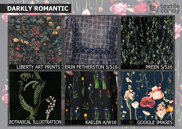
In my Spring/Summer 2016 catwalk report I got quite excited about the new romanticism trend with all of the hand painted botanical illustration prints, I especially loved the yin and yang feel in the colour palettes as both dark and light botanicals were evident in most collections (http://textilecandy.blogspot.be/2015/11/print-trends-springsummer-2016.html). It was extremely reassuring to go to PV and see that they were promoting this trend, it's always nice to have the reassurance that your predictions are correct. The Premiere Vision trends entitled 'Darkly romantic' and 'Sugary romanticism' are the Spring/Summer 2017 predicitions of how the SS16 New romanticism trends will progress.
Sitting nicely alongside the lighter botanical trend of 'Sugary romanticism' is 'Indiana blooms'. In the Premiere Vision print area there were two trends entitled 'Indiana blooms' and 'Indonesian carvings', I felt that these had the same delicate floral aesthetic and so have combined them under one title. The inspiration for this trend is the 18th century Indian floral printed cottons known as chintz/toiles. This is actually a time period I'm extremely interested in and I might look into it in some more depth in a future blog post, but here is some more information just in case you're curious: http://demodecouture.com/cotton/
From Indian to African, the Spring/Summer 2017 trend predictions included a trend called 'African fauna'. Moving away from the popular, and somewhat cliche, African mudcloth designs that fashionistas seem to love to talk about under the blanket term 'ethnic'(can you tell that I am somewhat irked by that haha), Premiere Vision showed a small range of loose, hand painted animal graphics and conversationals in earthy tones of deep brown, cinnamon and ochre. This trend was hinted at in both Valentino and Rochas SS16 collections, it is nice to finally see some conversational and placement prints making a comeback.
'Aquatic life' is a trend prediction for Spring/Summer 2017 that will hardly come as a surprise to anyone who pays attention in the fashion world. Appearing in the SS16 collections of Emilio Pucci, Stella Jean, Tsumori Chisato and Gucci, aquatic scenes from fish to coral and scuba divers were all over the runway. It will be extremely interesting to see if this continues into the Autumn/Winter 2016 collections.
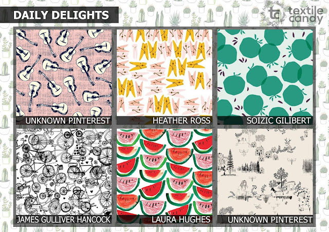
Conversationals are back, FINALLY. They seem to have been absent from the fashion scene for quite a few seasons. As my current job involves designing conversational prints for men's shirts, finding inspiration for this in a conversational-less world has been tough. Most of the new prints for SS17 in this area revolve around scenes from daily life from washing line pegs, to bicycles. Fruit related prints were also popular, particularly when done in a watercolour paint effect.
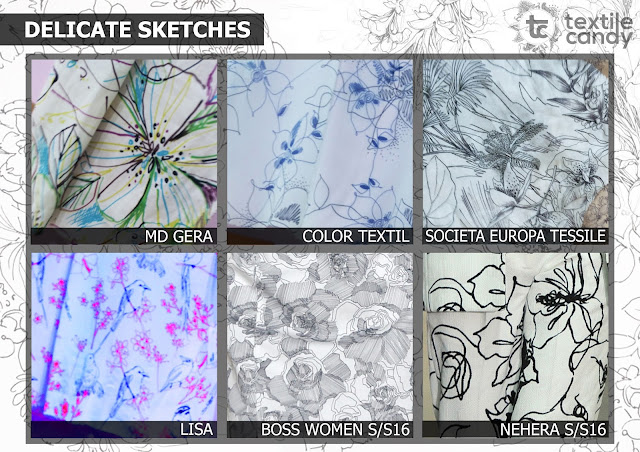
Outline prints have been consistently popular for quite a few seasons now which makes me question the longevity left in this trend...still Premiere Vision has predicted it will continue for Spring/Summer 2017. Lacking in colour(which is great for any commercial print designer limited to one screen) and with much finer lines than previously, this trend manages to be delicate and graphic at the same time. No matter how long this trend continues, it still looks fresh. I'm definitely going to be working into it a little and trying out this style on some conversational prints.
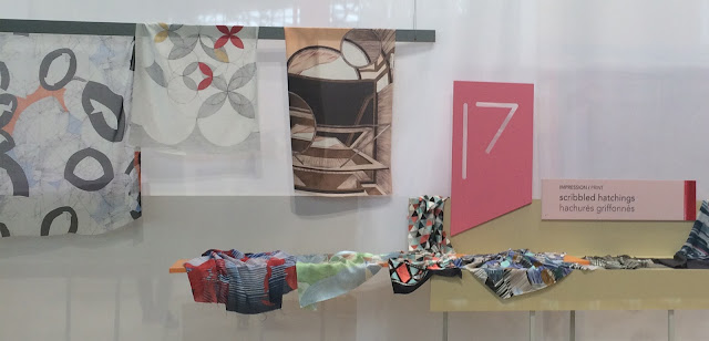
Scribbled hatchings was the only slightly geometric trend prediction for SS17. This trend was also predicted at Premiere Vision for SS16 (http://textilecandy.blogspot.be/2015/02/premiere-vision-springsummer-2016.html) but didn't seem to amount to anything, which is a shame as I actually quite like it. Hopefully the Autumn/Winter 2016 will start introducing these cross-hatch style prints as I do feel like the industry is missing a geometric edge to balance out all of the florals.
There were two trend predictions for Spring/Summer 2017 that I struggled with slightly, partly due of the trend titles but also because I don't feel like I necessarily agree with how they were presented. 'Primitive compositions' consisted of mark making tiles put together in a mismatched collage effect in the deep,rich colours we generally seem to associate with Africa. I love this idea and believe tiling will be a big print trend, it seems to be taking over instagram with style and travel bloggers using the #ihavethistingforfloors #ihavethisthingfortiles, but I have a really big problem with the word 'primitive'. Maybe it's a personal thing but I find it as dismissive as the blanket term 'ethnic'.
The second print prediction I had problems with was 'circular ornamentation'. I can completely understand the thinking behind this prediction as, with the increasing popularity of yoga and Indonesian travelling, social media has seen a rise in the popularity of Buddhism and the circular mandala designs that are associated with it , but I wasn't a fan of how this was presented at Premiere Vision. Instead I have combined these two trends to create a new board called 'global ornamentation'. This trend takes aspects of intricate mandala designs and combines them with more geometric mark making patchwork tiles to create a modern bohemian print trend. I actually think this might be my favourite trend of the entire bunch.
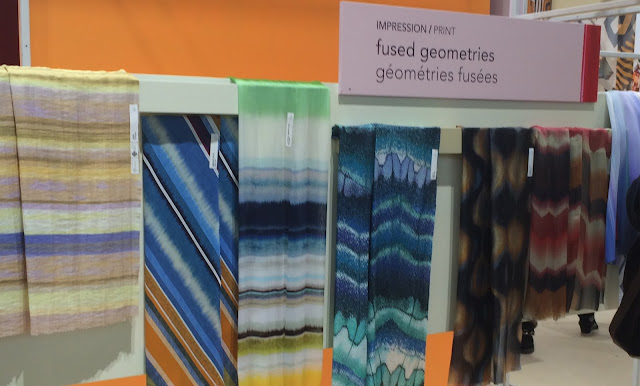
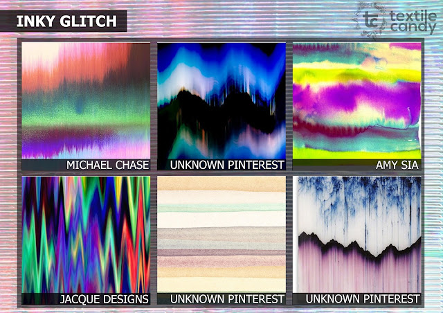
'Fused geometries' was the only slightly digital print trend at Premiere Vision for Spring/Summer 2017 and it reminded me a lot of the SS16 PV trend prediction of blurred visions (http://textilecandy.blogspot.be/2015/02/premiere-vision-springsummer-2016.html) although this one is less digital and more hand dyed.
I have renamed 'fused geometries' as 'inky glitch' as I don't really feel like there is anything geometric about this trend and they really remind me of a hand painted, watercolour/ink version of the computer glitch trend.
So there you have it- a whole set of 15 print trend predictions for Spring/Summer 2017 based on what I have seen at Premiere Vision. It would be great to get your feedback on these and let me know which ones you think will be successful/unsuccessful.
Also, If anyone would like me to work into creating a more detailed trend pack for them please don't hesitate to contact me on here or on my new website: www.textilecandy.com.











1 comment:
Thanks for sharing, nice post! Post really provice useful information!
Giaonhan247 chuyên dịch vụ mua hàng mỹ từ dịch vụ order hàng mỹ hay nhận mua nước hoa pháp từ website nổi tiếng hàng đầu nước Mỹ mua hàng ebay ship về VN uy tín, giá rẻ.
Post a Comment