It has been around a month since my last blog post, apparently I find it incredibly difficult to religiously blog every week and now I have a build up of thing to share- quelle surprise!
So this blog post will be about my two recent freelance briefs. Since I last blogged I have created a collection of 5 designs inspired by Roberto Cavalli's Fall 13 collection. I must say that I found it surprisingly enjoyable, florals after all are my complete nightmare but with a great deal of persistence I have finally taught myself how to paint flowers. This is particularly good as I seem to constantly get comments bout my portfolio lacking floral designs.
As with all my briefs I made a pinterest board of research and inspiration, consisting mostly of dark dutch baroque florals and the work of other designers who have previously drawn inspiration from this style of art (Alexander McQueen and Dolce & Gabanna being two of these).
Feel free to take a look, I've posted the link below:
I love being quite 'hands on' in the beginning stages of my designs and this brief was no different. I stuck to the same colour palette used in the Roberto Cavalli collection and made sure I painted a variety of different shaped florals to make the designs more interesting.
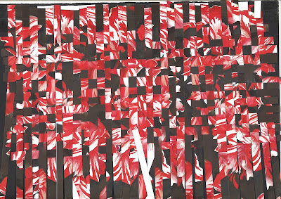
Then came the fun part- I scanned, photocopied and printed the paintings so that I could cut them into strips and weave them together to get the woven abstract feel that appears in the background of the designs in this collection. Weaving actually proved to be surprisingly therapeutic and I really like how effective this technique was in creating a backdrop for the florals.
Although I can't post the whole designs for copyright reasons, here are the fabric samples hanging in my room, I think they work quite well together.
Next brief: Clover Canyon Fall 2013, who I absolutely love, they seem to be the American alternative to Mary Katrantzou, but oh my did I struggle with this one!
This is my most recent brief and for some reason I just couldn't quite understand what the theme/inspiration for this collection was. Of course now, after extensive research(hence the epic size of my pinterest board) I realize the inspiration came from Russian affluence, ballet and the Winter Palace. This worked perfectly with the colour scheme I was given by Black Cherry: teals, purples and icy blues.
As you can see below my image research encompassed all things from Faberge eggs and painted ceilings to linear constructivist art with its solid colours and bold geometric shapes. I struggled with finding a balance between minimalism and affluence in this brief but I got there in the end and shall post a photo of the samples when they arrive.


No comments:
Post a Comment