Monday, 29 April 2013

Pinterest

To help me with my freelance research I've jumped on the Pinterest bandwagon. I'm going to make a Pinterest board for every freelance brief I do, you can follow me at: http://pinterest.com/beckyloisburns/
Here are the boards so far...


As per usual I am massively behind on blogging. Apparently I'm not very good at sticking to personal targets like blogging every Friday. In my defence I have been extremely busy. I started my new job as a design assistant, moved all my stuff down to London AND got an amazing new flat in a warehouse conversion.
My living room, complete with hammock :)
More exciting news is that I have sold 3 of my freelance designs- 2 in London and 1 in Milan. This couldn't have come at a better time as I have been so penniless recently and was close to giving up on freelance work as it seems to have been costing me far more than I'm earning from it. Hopefully this will no longer be the case! 

Now that I've been living down here for 2 months things are starting to settle down a bit and I feel like I can dedicate more time to blogging updates. Here are a few images of the type of things I've been doing at work

Iain Macarthur's detailed sketches


My interpretation of Macarthur and the lace samples created from my sketches.

Mara Hoffman AW13
Animal print camouflage designs


Pick me up: Graphic Arts festival

One of the perks of being a design assistant is that I have to go to exhibitions and galleries for research!On Friday work paid for me to go to the Pick me up: Graphic Arts festival at Somerset house. Such an amazing experience and SO inspiring!I've added some images from the exhibition below...


Some trends among the illustration included: pop art, neon colours and illustrated animals. Detailed animal illustrations seem to be becoming increasingly popular, this is something I want to experiment with in my own work. Having the opportunity to look around the exhibition made me eager to get back into doing my own artwork outside of work.

I also went to look around the Brick lane Sunday market yesterday with some friends. I love the atmosphere there and am really interested in trying to see if I can create some designs to put on t-shirts so that I can have a stall there. 

Friday, 1 March 2013

New York Fashion week

Look at me blogging in advance for this Friday  I have learnt my lesson and am starting in advance so that a blog entry will definitely be posted tomorrow!.

So tomorrow I am moving to London for a month to my internship with Mary Katrantzou- words cannot express my excitement, not only for the internship but for leaving Lancaster in general. Tomorrow is also the day of my second interview for a design assistant job I applied for a few weeks back. In my last blog I mentioned the project I had to do for the interview so I'll give a few more details about that. I was asked to choose an A/W 13 trend and create a research board, 6 outfits for a new look customer(including at least 3 pieces of knitwear and one simple jersey print) and a development page of flat working drawings. Needless to say after my review of LFW the trend I chose was red, black and white....
Red, black and white AW 13/14 trend.


The 6 outfit collection for a 'New Look'customer.
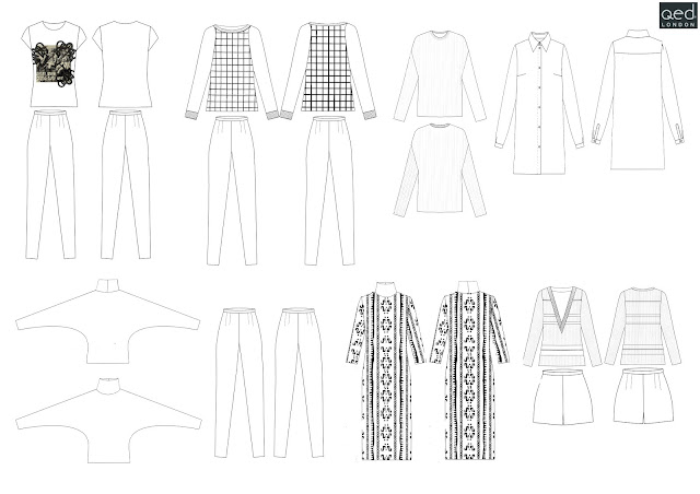
Working drawings.

So that's the project, hopefully it's enough to get me the job and after my internship I won't need to move back to little old Lancaster.

Anyway...continuing the fashion week reviews, here are the trends I have picked up on from New York fashion week. As with London fashion week there was a dominating presence of black, white and red on the catwalk. In the LFW collections I was unsure whether this colour combination evoked a sense of wartime propaganda or oriental design, the New York collections, however, took obvious inspiration from the orient(shown in the prints of Concept Korea and Vivienne Tam).

Black and white trend.

Red, black and white trend with an oriental infusion.

Another trend proving to be popular on the New York runway was folk style florals. Although this trend didn't feature in London, New York designers such as Naeem Khan and Mara Hoffman drew inspiration from the jagged shapes of Polish Wycinanki(paper cut outs). Duro Olowu, Oscar De La Renta and Red Valentino took a different approach using folk style painted florals in their designs.


Left: Polish Wycinanki designs, Right: Russian florals.

Folk inspired trend.

Clover Canyon was another brand which caught my attention at New York fashion week. Although their designs do not follow a specific trend, the mirrored prints are very detailed and reminiscent of Mary Katrantzou's earlier work. 


That's all I have to say about New York really, I'll follow this up with Milan and Paris shortly x

NB: While writing this blog post I have had some EXTREMELY exciting news- I GOT THE JOB!!!!Unfortunately this means I won't be able to do my internship with Mary Katrantzou as I start my new job on Monday, but I am so so SO excited!

Sunday, 24 February 2013

London Fashion Week

So much for me blogging every Friday huh!I need to get into a blogging routine properly. This week has been pretty hectic hence the lack of blogging. My freelance deadline was on Friday so I was rushing to make last minute alterations to my designs. Since then I have been frantically reworking my entire portfolio for two interviews which I had in London on Friday(one for a design assistant job with a clothing supplier and one for a 4 week internship with Mary Katrantzou). On the bright side it wasn't a wasted trip as I got the internship and I was also asked to do a project and come back for a second interview for the job. Fingers crossed my project is good enough to land me the position!

Anyway enough excuses for my blogging incapabilities!

As everyone even remotely interested in fashion and textiles knows Friday-Tuesday was London Fashion Week where designers showcased their AW13 collections. Spring/Summer collections were a monochromatic shock and the designers' Autumn/Winter collections have been a continuation of this featuring in Meadham Kirchoff, Fyodar Golan, Jean Pierre Braganza and Sass&Bide. Vibrant red was injected into a large proportion of the catwalk collections, although this colour combination creates an oriental feel in some design,s these three colours(red,white and black) have strong associations with both communism and fascism causing the collections to become quite emotive.
Black and white trend.
Black,white and red trend.


Left: Russian Communist propaganda poster from the 1920's, Right: Fascist Nazi swastika from the 1940's.


Despite this predominantly being a Print blog I feel I should give a nod to some of the other catwalk trends; chunky knitwear being a particular favourite of mine, I can't wait to get my hands on a sister by sibling style thick scarf. Thick knitwear also featured in the collections of Rohmir, Bora Aksu, Apu Jan, Jale Hurdogan and Mulberry. Another Autumn/Winter 13 knitwear trend that is set to be extremely popular, judging by the amount of designers who included it in their collection, is the polo neck. The 1970's neckline is making a huge comeback- Sister by Sibling, Daks, Eudon Choi, Jasper Conran, John Rocha, Mulberry and Pringle all championed the return of the polo neck in their collections.

Chunky knitwear trend.


Polo neck knitwear trend.


On the opposite end of the neckline spectrum is the emergence of deep v-neck dresses. Although they look extremely sophisticated on the catwalk models it will be interesting to see how this trend filters down to the high street, deep v-necks are extremely hard to wear #braproblems and without the bra there is always the fear that one might pop out inappropriately. Despite this designers such as; Peter Pilotto, Emilio De La Morena, Julien Macdonald and David Koma all included v-necks in their designs. The V-neck trend also filtered into the seasons' knitwear with Sass&Bide and Jonathan Saunders introducing v-neck knitted sweaters.

Deep v-neck trend.

One trend I was extremely happy to see in the AW13 collections was the presence of art deco imagery. My most recent freelance brief was to create a collection of designs using black and white decorative imagery in which I chose to use art deco shapes as the inspiration, I can't explain how happy I am to see it in other designer's collections, it means I may have a hope of selling some designs.

With films like 'The Great Gatsby' set to hit our screens this year it is no wonder that fashion has turned to the past for inspiration. The glamour of this 'golden era' is something the designers have imitated throughout their collections. Holly fulton uses art deco geometric imagery as a staple in her print designs and her AW13 collection had some fine examples of this. I was surprised to see that Temperley London had also looked to the deco designs of the 1920's for inspiration, the mirrored layout of the prints mimic typical art deco style and the dropped waist "flapper"dress also makes an appearance in the Temperley collection. 

Temperley London's collection- art deco style bodycon dress, drop waisted "flapper" dress and print close ups.
L'Wren Scott is another designer who's AW13 collection drew direct inspiration from "The Golden Era" with art nouveau designs*and obvious references to the paintings of Gustav Klimt.
*NB: art nouveau was the art movement that pre-dated art deco it comprised of decorative imagery, natural colours and curved lines, art deco was a direct reaction to the end of this movement and it caused geometric shapes and bold flat graphics to become popular.


L'Wren Scott AW13 and Gustav Klimt comparisons.

One final print trend, which doesn't come as too much of a surprise for the Autumn/Winter season, is animal prints. I've never been a huge love of animal prints but I do love the black and white animal prints shown by Preen(leopard print) and Burberry(giraffe print) and the pointillist style of Holly Fulton's tiger print.
Animal print trend.


So there are the trends I've picked up on from London Fashion week, when I get the chance, hopefully at some point this week, I will also blog about New York and Milan. 
Bye for now x 


Friday, 8 February 2013

Recent Purchases, New brief and LFW!

As I said I would, I indulged myself a little at the weekend with some birthday shopping... and as I felt a little down about being a whole year older the indulgence seems to have continued throughout the week. 


Bag River Island, Earrings Topshop, Shirt Zara.

For so long I have been wanting some American Apparel disco pants but, despite not being the most frugal person, £75 seems a little extravagant. Imagine my delight when I came across daisystreet.co.uk's range of £22.99 disco pants. Doing some quick calculations I came to the oh-so-logical conclusion that by saving myself around £50 by not buying the American Apparel versions I could afford to buy two pairs of daisy street disco pants instead of one.


Daisy street disco pants in emerald green and navy.

Aside from my shopping antics, I have been carrying out mountains of research for my new freelance brief on decorative black and white imagery. Geometric shapes taken from Art Deco jewellery and Holly Fulton's graphic print placements have been the main influence behind the 6 design ideas featured in the collection. I would love to be able to share them on here but can't due to copyright laws etc but I can share the images that have inspired the designs. 


Black Cherry's collection, featuring 12 of my designs so far, is currently in Sydney and is set to go to Melbourne, London, Milan and LA in the coming weeks so fingers crossed my designs will catch the buyers' eye.


With London Fashion week just around the corner next weeks blog entry is set to be be full of catwalk trends for A/W 2013. Hopefully the designers will provide some interesting textile candy which I can feature on here. Ciao for now x


Friday, 1 February 2013

Monochrome springtime shocker

As a colour enthusiast I'm not usually a fan of monochrome, but I could not be happier to see the Black and White takeover of the Spring/Summer 2013 catwalk. What a refreshing change from pastel florals, who'd have thought- black and white in spring!


Another springtime shocker was the dominance of geometrics on the catwalk from diagonal stripes to the checkerboard designs championed by Louise Vuitton. Designers seem to have all shared a desire to return to the 60's in their SS13 collections. Many used bright, borderline garish, pops of colour to brighten up their designs (Issey Miyake, Balmain, Unique and Holly Fulton) yellow being a particluar favourite.

The best from the high street:


A disappointing lack of yellow, but, let's be honest, yellow isn't the most commercial of colours as so few people can wear it well. Still a promising response to the catwalk from the high street stores. As it's my birthday weekend I intend to indulge myself with a little monchromatic shopping fix. 
That's all for now x