Sunday, 28 December 2014

Pre-fall 2015 favourites!


I finally have a week off!!!!Of course I intend to spend it catching up on blogging and runway trends so it's not really a complete week off. I have been really busy recently working on some freelance illustration commissions(which will feature in a blog post soon)and updating my portfolio which is no easy feat- I completely underestimated the length of time a portfolio upgrade takes! 
Anyway I'm back home in the lovely North of England and am finally having chance to sit down and look through all of the Pre-fall 15 collections and figure out what trends are coming through, I'll be posting these over the next few days.

One thing I did notice when looking at the trends was the increased quantity of images I was having to sift through, it seems that designers are now treating the Pre-collections as a whole new season with almost every key designer taking part.

Anyway, here are some of my favourites:


This collection is the perfect combination of American Indian Navajo patterns and bright folkloric florals. Recently I have been trying to push pointillism as a trend after it featured in the SS15 collections of Issa and Valentino, intricate dotwork is also used to add detail to the florals in this Alice&Olivia collection. One of the colours that seemed to be quite dominant throughout the Pre-fall 15 collections was orange and Alice&Olivia have used it perfectly alongside burnt red, navy and cobalt blue.


The BCBG Max Azria collection is another of my favourites. Illustrative linear shapes with primary colours used to fill in areas- this collection is fresh and fun.


Oh Nicole!!!Such a breathtaking collection. It seems like a softer version of the Etro aesthetic with pattern mixing, print layering and persian rug motifs. Even the styling of this collection plays on the boho look with the long loose hair and the open shoulder maxi dresses. Judging by the amount of open shoulder, bardot necklines and cutout shoulder styles we have been seeing on the runway recently we appear to be moving our focus towards the shoulders.


I just love everything about this collection. An ode to the 80's, Sachin&Babi have created a collection reminiscent of Memphis prints even down to the monochromatic grid backgrounds. I also love the flying fish applique motifs used- there's been a huge increase in the usage of applique recently and this looks like it's here to stay for the foreseeable future. 

That's all for now but I'm working on some trends to post over the next few days!

Saturday, 27 December 2014

British textile industry- Hawick Knitwear.

As we are now in the depths of winter and because I've been working, quite ironically, for a knitwear company for over a year now, I decided to welcome in the cold weather by attempting to learn how to knit. I set myself the challenge of knitting a chunky scarf(instead of buying one) and consulted my Nan on how to actually do this. I bought some huge chunky knitting needles and 3 balls of different coloured wool to make a questionable looking twist.

Me being me I then left it about 3 weeks to get started, by which point I had forgotten every pointer my lovely Nan had given me. As a result my "scarf" was made using an improv/non existent stitch and quickly began to take the form of a hand muffler by curling in on itself. Despite this the "scarf", which is as long as it is wide, is finished and is actually the warmest most snuggly piece of knitwear I've ever owned.


Due to my many problems in making the scarf, and the fact that it is currently held in a snood-like shape with two hair bobbles(attaching the two ends together is on my huge to-do list) I think it may have been a lot easier for me to have left it to the professionals and bought one from a shop, but I am far too stubborn and persistent for that. It does feel extremely good to be able to say that I now work for a knitwear company and can actually knit...well sort of!

Although my new scarf has questionable aesthetics; is extremely oversized and isn't the most commercial looking thing, I made it! The pride you have after creating something yourself is incomparable to any other feeling. Knowing that every dropped stitch/hole in the scarf was created at a point where I was near giving up on the whole knitting thing altogether reminds me of the important of persistence. I think hand made garments are what the British high street is lacking.


The British textile industry, once booming, is now almost bust. With British retailers and high street giants exporting the manufacturing of their products overseas to countries like China, Hong Kong and Bangladesh, the industry that once financed British Imperialism has almost completely diminished. The British textile industry has found it impossible to compete with the low production costs and short lead times of overseas manufacturing leaving many British factories with no choice but to close down. As a reaction to globalisation and British manufacturing being shipped overseas there is an increasing demand for British heritage brands and luxury 'made in Britain' garments which is where surviving British textile mills/factories are able to thrive.

Standfast&Barracks main building, Screen printing machine, Quality Control checking machine.
After graduating in 2012, I spent 4 months working at Standfast&Barracks(above), a textile printing factory in my hometown of Lancaster (http://www.standfast-barracks.com). In all honesty factory work had never been part of my career plan, I, in all my idealistic naivety, had expected to be given a Print design job straight after my graduation. After travelling to countless interviews all over the country I decided to pursue a different route into my "dream job". On reflection I feel so fortunate to have lived in a town that still has a Textile factory as this turned out to be my gateway into the fashion industry. Although I worked to the point of exhaustion doing nights shifts in the factory and then working freelance in the day, I feel so much more informed about the printing process than I would have done had I not experienced this area of work. It was during this 4 months that I realised the importance of keeping some of the textile manufacturing process in the UK. I actually wrote a blogpost on this, and the decline of the British textile industry, over a year ago:  http://textilecandy.blogspot.co.uk/2013/07/the-decline-of-british-textiles.html.

I have recently come across one of the few British knitwear companies that still manufactures their garments within the UK. Hawick knitwear has provided luxury knitwear since 1874 and has remained steadfast, despite adversity, managing to prosper while other companies have collapsed.


Video c/o Hawick knitwear(below).


In a world dominated by fast fashion forcing retailers to compromise the quality of their garments, consumers are beginning to realise the importance of quality and long lasting clothing. Fashion trends are constantly changing but certain items are a wardrobe staple. Knitwear, for example, never seems to age- we find new ways of playing with stitch and yarn composition but a crew neck cable jumper has the longevity other garments lack. With the majority of the British high street manufacturing their products in factories overseas, the quality of knitwear on the high street is compromised. Jumpers are not as warm and garments are finished poorly causing them to give in to wear and tear very easily. For only a few pounds more, a luxury hand-finished, made in the UK garment can be purchased which has a guaranteed longer life. Unfortunately most of these heritage brands have been overshadowed by high street giants, but with British fashion houses like Burberry, Mulberry and Pringle of Scotland having a second lease of life on the runway, luxury 'made in Britain' brands seem to be clawing their way back.

Pringle of Scotland SS15, Mulberry SS15, Burberry Prorsum SS15.
If anything this proves that heritage brands are adaptable, after surviving the many recessions of recent years, brands like Hawick knitwear are adapting to new customers with Marks&Spencer buying their Best of British cashmere sweaters from Hawick. Engaging with emerging markets in Japan and carrying out collaborations with heritage brands like Harris tweed, Hawick knitwear appears to be going through a re-branding process. Heritage British made knitwear is fighting back- hopefully this is something we will see other heritage brands beginning to do. In a world that appears to be controlled by social media and an online footprint, being connected with the target audience online is of the upmost importance- this means re-designing websites, creating up to date blogs and having a social media following. If heritage brands can get on board with this new form of sales and advertising then they can flourish.

Pieces from Hawick knitwear's current collection.

If anyone knows of any other British based textile manufacturing companies I'd love to hear about them whether that be  knitwear/cotton mill or a fabric printing company. It is important that we stand behind local manufacturers and get the British textile trade back on the world map.


Monday, 20 October 2014

Exhibition work and my attempt at a shabby chic effect frame!

Apologies for the lack of posts this month, I've been extremely(massive understatement) stressed about the exhibitions I'm doing which both start this month. As I write this I am currently sat in my lovely dishevelled room in Clapton pond attempting a shabby chic effect on some picture frames for the Parallax Art fair event in Chelsea town hall. It's not going too well at this stage so I'm giving myself a time out while I, quite literally, wait for paint to dry...

I obviously decided I didn't have enough work to do and being the thrifty/tight pursed person I am decided to source my frames from local charity shops to reduce the price. A good idea in theory  but apparently getting something to look sufficiently old and weathered is harder than I had anticipated. 

Anyway in the process of attempting this I came across a really helpful blog post that I want to share with you all as it's really helped me out today http://laraberchdesigns.com/distressing-a-picture-frame/

As you can see from the below photos I am surrounded by tealights...romantic night in is the general assumption here- no such luck...I am waiting for the wax to melt so I can use it on the frames..standard weekday evening activity!


Along with the above tea light/framing attempt photos I'e included some images of the pieces I'm working on for the Parallax art fair. As you can see none of them are finished...apparently I am a very last minute person!

Here are some photos of my current exhibition in Arteria in Lancaster- I'm so pleased with how they look in situ!The team at Arteria have done a really good job of organising the gallery space and everything seems to flow together beautifully.


Horatio the hare made it onto the winter shopping day invite!


I've also included a link to the Parallax Art fair(http://www.parallaxaf.co) which runs this Friday 24th and Saturday 25th at Chelsea Town hall where I will be displaying further work......work which I have two days to finish!


Anyway best crack on with my attempt at shabby chic framing! I'll let you know how it goes this weekend!

Wednesday, 8 October 2014

Inspiration or exploitation- where are the boundaries?


Recently I was invited, as a plus one, to an Eritrean wedding. I was extremely excited at the prospect of going to my first African wedding and having the opportunity to experience a different culture with a particular interest in the traditional dress the people attending would be wearing. 

Details from Eritrean embroidery

As many people do, I had a preconceived idea of what this traditional dress might look like. In my ignorance I was expecting a riot of bold colours and overwhelming clashing patterns, what I found, however, was somewhat different. The Eritrean traditional dress is loose fitting and predominantly white with a strip of colourful patterned embroidery towards the bottom, extremely understated and demure in comparison to my expectations.

 I was taken aback by how much the recent Autumn/Winter 2014 Valentino collection had taken inspiration from the embroidered patterns I had seen at the wedding. 

Valentino Autumn/Winter 2014
Seeing this type of design in its traditional form(not being paraded down a runway on an extortionately priced garment) got me thinking about how high end designers source their inspiration. Is stealing the native designs from a poorer community exploitation or just a natural consequence of globalisation? Should these communities be receiving some of the profits...or at least some recognition for their designs? There is a very fine line between using someone's artwork as inspiration and imitating it to create a replica. Where do we draw the line to separate design inspiration from exploitation?

In one of the WGSN trend seminars I attended at Premiere Vision, the painted mud huts of the Ndebele tribe in South Africa were referenced as being a key point of design inspiration for the WGSN confluence trend for Autumn/Winter 2015(I will be doing several blog posts on the WGSN trend seminars I attended at PV over the coming weeks).

Ndebele tribe designs


Although WGSN has referenced the tribe where these designs originated, you can guarantee that the suppliers and high street stores that follow this trend will imitate the artworks without accrediting the design source. 


This same tribe(the Ndebele tribe) was also used to inspire Mara Hoffman's early work(see below) and has been featured in Topshop and on other various garments and footwear. Even Kim Kardashian has been photographed wearing a Ndebele inspired print, I'm pretty sure we can accurately guess that she has no idea where the pattern she wears in the below photo originated.


 I can't help but question how fair it is that the artwork of these communities is being used repeatedly without them being aware or receiving any of the profits. Surely something should be done to protect their designs?Or if something is already being done maybe more awareness should be raised? 

I guess part of the problem when protecting the intellectual property and traditional crafts of a tribe/specific culture is how to differentiate between the work of an individual and the work of a community. Namboniso Gasa, a researcher and analyst of gender, politics and cultural issue(quoted here:http://www.theguardian.com/world/2013/nov/08/south-africa-debates-protect-lullabies-beadwork ) believes that,

 indigenous cultures all over the world are not insular; they influence each other...It's not necessarily the same as exploitation. A law might limit and suffocate artists in their particular creative genre."

This is a very valid point- copyright legislation is so extreme, particularly in the US, that it inhibits creativity. In my opinion we should be able to draw on a wide variety of sources across various cultures, religions and contexts without feeling constrained by copyright laws. This being said, I strongly feel that for high end designers, like the aforementioned Valentino and Hoffman, it should be mandatory to state the sources of their inspiration. Although this is not direct exploitation, it can lead to design source ignorance which I think we need to put a stop to. If you work in design, print in particular, know your sources!!! 

I experienced an infuriating example of design source ignorance several weeks ago. A buyer, from a company I shall not name(as I don't really buy into public humiliation), sent me a moodboard of inspirational images for their new collection. The moodboard trend was titled 'Latin style'....the prints used as inspiration,however, were all dutch wax prints/African ankara fabric. A typical example of design source ignorance- not only are Latin America and Africa on completely different continents, they also use completely different prints and design styles. 

In my opinion, high end designers should lead by example and state their sources. Instead of claiming that all prints are 'ethnic' they should give credit to the original design sources.

If anyone is aware of any organisations that aim to protect traditional artworks and creativity please let me know as I would be really interested in doing a follow up blog post on this!


Debut exhibition at Arteria gallery in Lancaster

For those of you who don't follow me on Instagram (www.instagram.com/beckyloisburns) or on facebook(www.facebook.com/textilecandy) you won't have seen the epic amount of illustration related spamming I have been doing in the lead up to my debut exhibition. The exhibition starts on October 9th at the Arteria gallery in Lancaster (http://www.arteriashop.co.uk and https://www.facebook.com/arteriashop) and continues until January 2015. 

Arteria gallery exhibition invite

Here are the framed images I submitted...


I'm actually really impressed with how the framed pieces look #humblebrag as I'm so used to seeing them as scraps of cartridge paper on my bedroom floor. I got the frames from habitat and, although they were a bit more pricey than I had originally intended(£20 each) I'm really happy with the way the white frame looks against the black mount.

Here are the individual illustrations and some close up shots of the details...


I'm also working on some work for the Parallax exhibition in Chelsea town hall which is taking place on the last weekend in October- https://www.facebook.com/pages/Parallax-Art-Fair . The date is looming and I have yet to actually start any work which, if I'm completely honest, kind of worries me. 

On that note I should probably go and actually do some sketching, I'll be doing some more posts soon with updates on what I've decided to work on :)


Thursday, 18 September 2014

Premiere Vision S/S16 print trend predictions


As those of you who follow me on twitter/facebook/instagram will know, I have recently been on a brief stint to Paris for Premiere Vision. As intense and stressful as being a print designer can be, an expenses paid trip to Paris is definitely one of the perks of the job. 

After months of working in an office environment suffocated by rails upon rails of knitwear, Premiere Vision offers a welcome print fix and an opportunity for me to get out of the office(a nightmare for anyone even remotely creative)and soak up heaps of new design inspiration. As per usual the Spring/Summer 2016 predicted trends did not disappoint, filling my mind with fresh ideas and the motivation to action them. I also had the opportunity to briefly(and it really was briefly as we were only in Paris for the day)look around some of the studios in Indigo and see the designs they were presenting and the trends they were following. Even seeing how each design studio sets up their stall and what graphics they choose to use can be extremely inspirational. My favourite was the backdrop for 'Pattern' studio (http://www.patterntextiles.co.uk/en/index)- colourful chintz florals layered over a rich orange background. I later found out, when looking through their current collection, that this particular print was created as a collaboration between all of their freelance designers, what a lovely idea!

A version of the 'Pattern' studio backdrop in pink.
As well as looking around Indigo and the Premiere Vision S/S 16 trend area, I also attended two WGSN seminars for Autumn/Winter 2015/16 and S/S 16, both of which got me extremely excited. I'm going to do a separate blog post for those as I came away with so much information that squeezing it into this post wouldn't do it justice. Hopefully I'll have those ready to post by Sunday. 

Anyway....I have put together some mood boards showing the Premiere Vision print trend predictions for Spring/Summer 2016...


I'm finding it extremely interesting,as I look through the S/S15 catwalk collections, how designers are moving away from the 90's look with its crop tops and bodycons towards a 60's/70's aesthetic featuring flat colourful florals, loose fitting shift dresses and longer length garments. It is also interesting to relate this to the above print trend predictions which seem to be moving in an 80's direction. Being a massive fan of 80's geometric prints, I naturally love the 'interlocking geometry' and 'playful schematics' trends and am so thrilled to see Memphis design patterns being re-introduced. So here is a separate Memphis moodboard in celebration of their return. 


In the spirit of the 80's, popular high street chain American Apparel has embraced Memphis prints by collaborating with Nathalie Du Pasquier(one of the designers from the 1980's Memphis group). Released in March 2014, this recent collaboration combines American Apparels' colourful, easy to wear aesthetic with the graphic post modernist prints that the Memphis design group became popular for. 


On a side note, I have also been pinning like crazy this week so, if you don't already, get following me on pinterest: http://www.pinterest.com/beckyloisburns/


Tuesday, 9 September 2014

Illustration work update

I am very aware that I have been an absent blogger for quite some time now. Life got busy, as it tends to do from time to time. In the last month I have moved house and now have a huge room in Clapton pond with two large windows, my very own bed(after sharing a room and a bed with my friend for 2 months!!!) and two large desks which are proving to be extremely useful given the amount of illustration work I am doing in my spare time. 

I have two exhibitions coming up in October- one in Chelsea town hall and one back home in Lancaster. If any of you want to visit either of them/enquire abut the work I'm showing there please leave a comment on this post and I'll let you know the details!

I have also been finishing off the very overdue floral artworks I have been creating for Bonito cafe in Enfield. With all of this work going on I feel like it's about time I shared some of my own work on this blog of mine. I started this blog hoping to combine reviews on other artists/designers, trends and rend forecasting and some of my own work. As of late/ Since the offset, I haven't really contributed much of my own work so that's what this blog post is all about. 

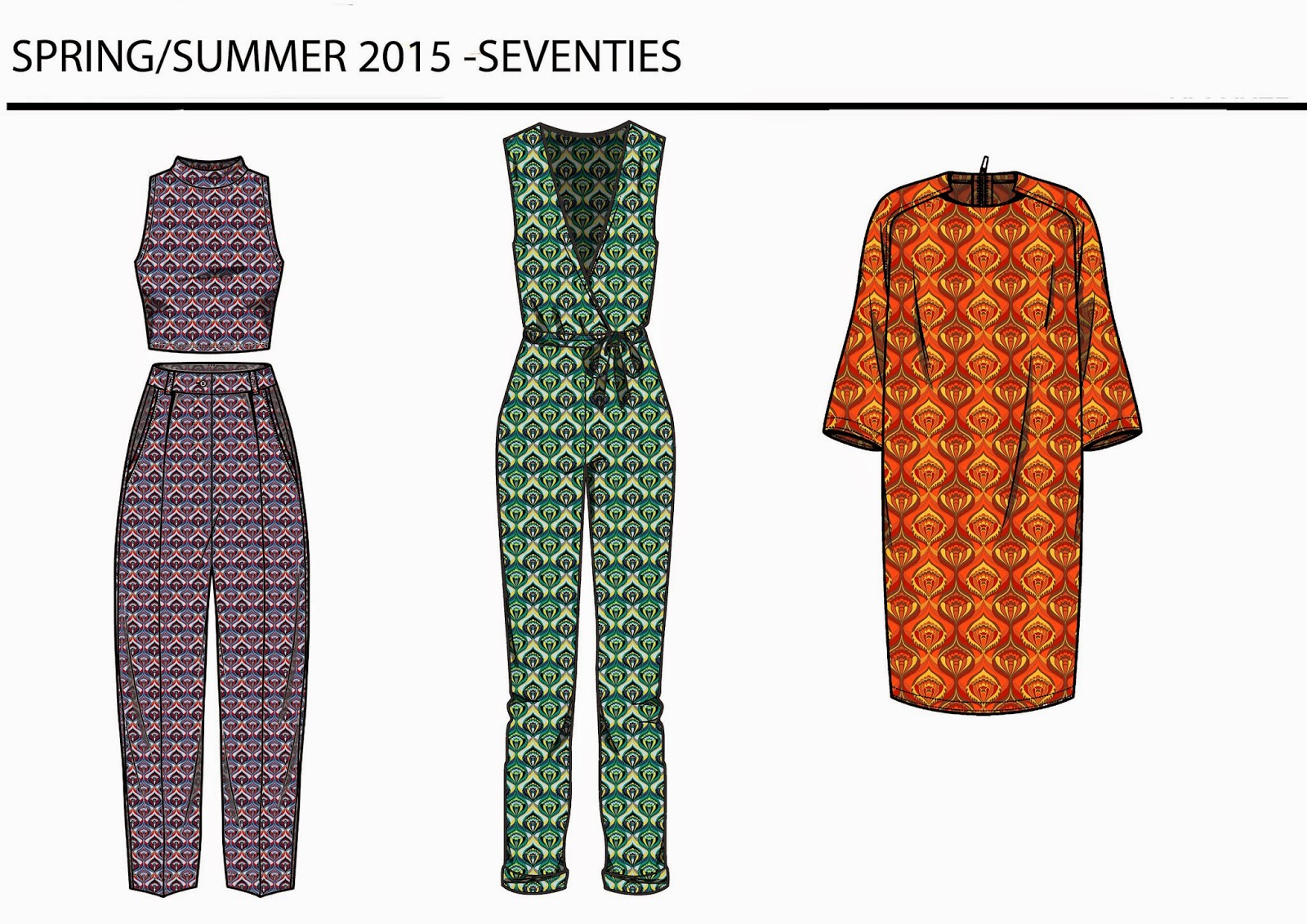
So first up is a mini project I set myself in response to the Cruise/Resort 2015 collections. I picked some of my favourite trends/the trends I feel will be most popular next spring(2015), these are: Seventies, Pastel/De-saturated palms, Zodiac symbology and Moroccan tiles. I've done a moodboard, print and CADs for each trend. To see my full Cruise/Resort 2015 print trend follow this link: http://textilecandy.blogspot.co.uk/2014/07/resort-2015-trends-post.html 


Next project I've been working on is a 6 piece commission for Bonito cafe in Enfield.  This is my first paid commission from an unbiased client, by which I mean no-one in my family/group of friends. Understandably I'm quite excited about this!This group of work has also been the first time I've used a wacom board to digitally paint straight onto the computer.

The preliminary sketch work.


Alongside this I have also been working on some artwork for Arteria gallery in Lancaster for their Autumn/Winter exhibition which runs from October-January. For this collection of work I have decided to create Autumnal animals in the patterned style I have come to love so much. They are still unfinished but here are the starting points...

Starting points plus the area of my bedroom I have turned into my exhibition prep wall....+wine(of course) 


So yeah... I've been pretty busy. I've also been getting some portrait requests in the same style as above which I'm quite excited about getting started on. Hopefully one day I'll be getting enough exposure to get me a steady supply of commission work, I'd love to do all of this full time one day. 
For now, however, It's just something I do on weekends nd in the evening- my own little form of escapism. 

The next post I do will most probably be a trend post as fashion week season has started again so I will be spamming you all with heaps of print trend boards over the coming weeks. I'm also going to Premiere Vision, a textile trade show, next week so will no doubt be doing a blog post on the predicted trends for Autumn/Winter 2015. 

If you've liked looking at y work you can see more on my facebook page: www.facebook.com/textilecandy or follow me on instagram @beckylois burns as I update these with new design work regularly. 

x